Tableau Tutorial

What can you do with Tableau?
Tableau can generate a wide variety of visualizations to help portray information within a dataset. Let's say, for example, you had a data set about $CO_2$ emissions globally over the last 30 years, and you were trying to answer two questions:
Who's the worst offender globaly for $CO_2$ emissions?
Have $CO_2$ emissions risen in the last 30 years?
- Using Tableau, you could generate two graphs like this:
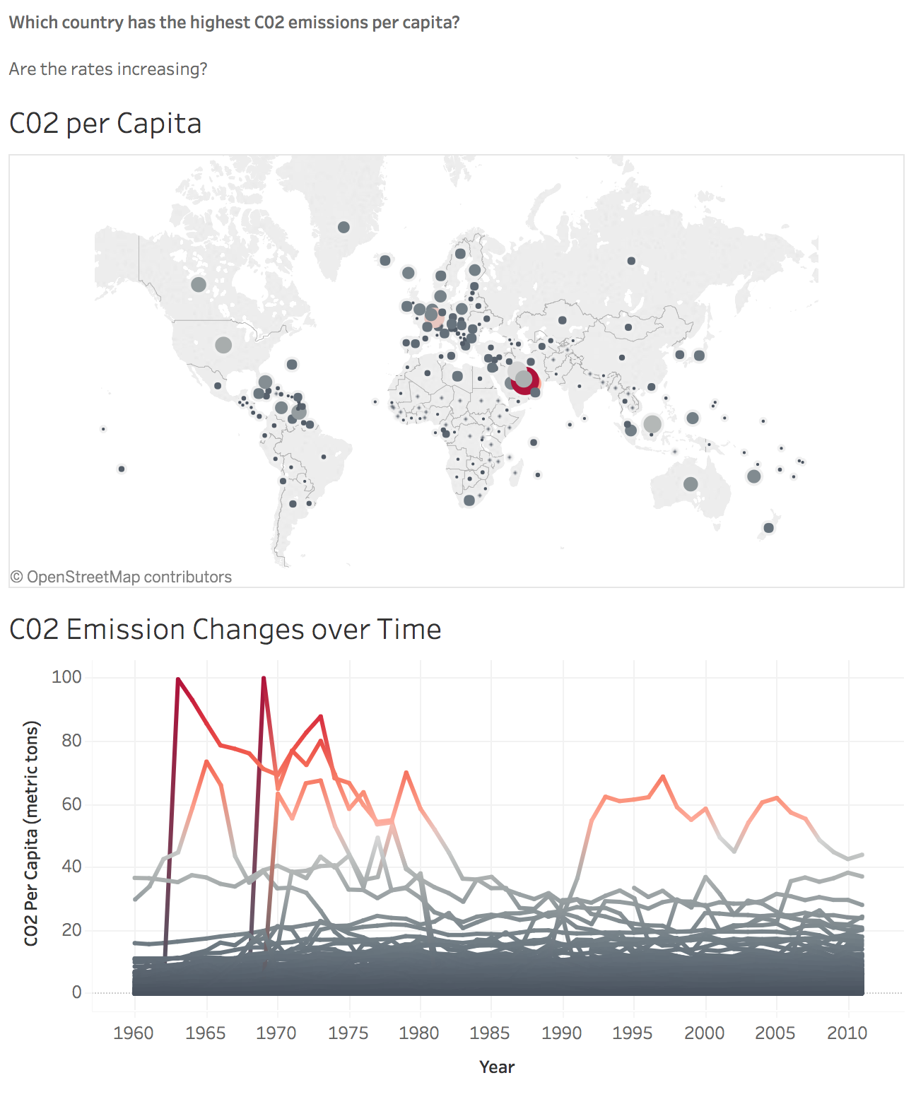
- In the first graph, two different dimensions/metrics are being shown. First, the size of a country's circle relates to the amount of $CO_2$ emissions they release. The bigger the circle, the more emissions. Additionally, there's a color scale. The more red the circle, the more that country is producing $CO_2$ disproportionately to their population. The second graph measures $CO_2$ emissions over time. Looking at the data we have here, it seems apparent that Qatar is the worst offender of $CO_2$ emissions. The purpose of the second visualization is to take a closer look.
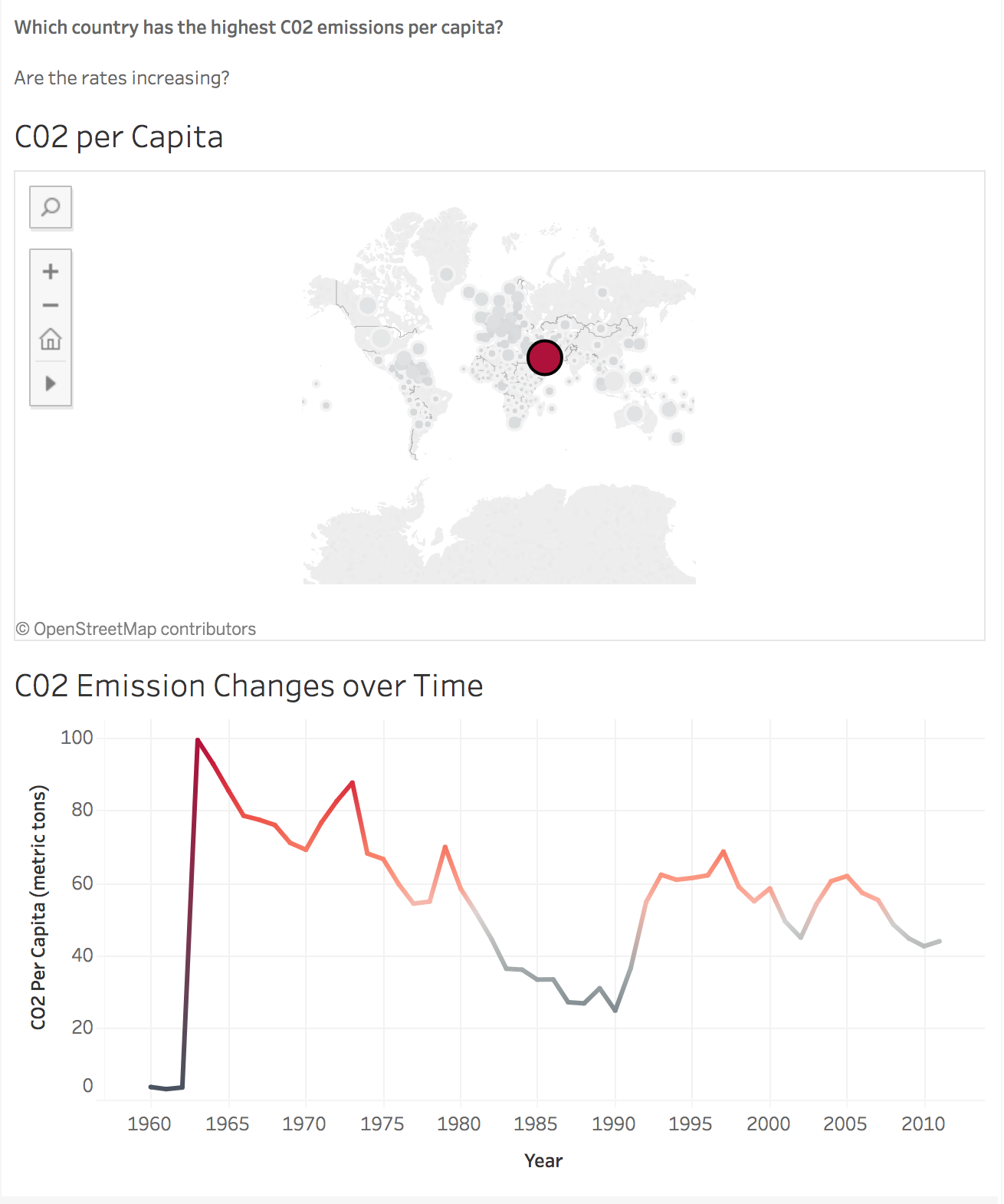
- This visualization shows that, while Qatar has historically been the worst offender, over the last 35 years they've started to make some serious progress. Now let's see what we can do with a different data set.
How to get started?
Through Tableau's academic licencing program, their flagship software Tableau Desktop is available to Denison students. This involves installing software onto your personal computer and activating the license with the appropriate key. You can get started by downloading and using the 14 day free trial of the Tableau Desktop. Below are the instructions as given us by the Tableau vendors:
- Go to the Tableau Desktop link: https://www.tableau.com/products/trial
- Enter your Denison email and click the
Download Free Trialbutton - Open and install the downloaded application. Note that it might take a few minutes to complete the verification process before you are able to initiate the actual application install.
It is also possible to use the Tableau Online product or the the limited version of the Desktop App for near term goals, but these will be insufficient when we move into the Relational Database unit of the course and beyond.
While the install is happening, it would be a good idea to take the steps to request your 1 year academic license for the software. You can request your academic license by going to https://www.tableau.com/academic/students and clicking the "Get Tableau for Free" and following the licensing questions/dialog.
Once you enter your information, you will click on "Verify Student Status." This often involves some kind of document that includes your name, Denison University, and a student id or class year. Over the years I have taught this class, the information has changed, so please post to Notebowl (if someone has not already done so) what information folks need.
First Step
As of the time of last update of this practicum, the trial version of Tableau (Professional Desktop) was 2020.1. When the application was opened for the first time, it gave a place to activate a license, that, once your form has been successfully processed, you will get from Tableau, or to activate the 14 day trial.
- Once you open Tableau Desktop 2020.1, you should see a screen which looks like this:

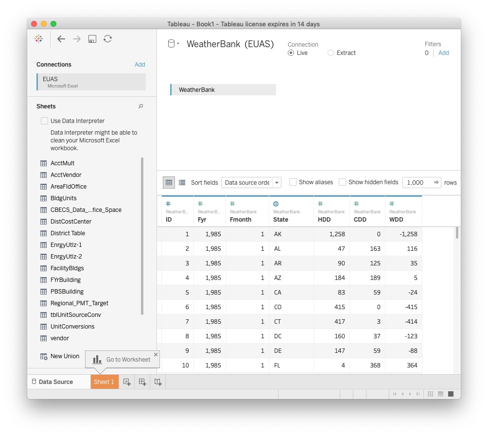
- On the left, you'll see a list of possible files to connect to. In simple terms, connect simply means to open (connect to) a datasource from within the Tableau system. Beneath the local file options in the left panel, you'll see an option which says To a Server. This allows you to pull data directly from online sources, without having to download them locally. Let's start practicing with a local data set. For this example, we'll use this following data set:
Go to the following Google Drive Sharing Link and Download the referenced zip file EUAS.zip
From wherever your download placed the zip file, drag it into the same folder as this
TableauTutorial.ipynb, under the class folder of the student class repository.Expand the file to obtain the
EUAS.xlsxfile.Once unzipped, you can move the
EUAS.zipto the Trash.
The purpose of this dataset is to enable calculation of energy needs to either heat, or cool a household to keep them at an average room temperature of 70 degrees. Heating degree days are indicators of household energy consumption for space heating. It was found that for an average outdoor temperature of 65 degrees Fahrenheit, most buildings require heat to maintain a 70 degree temperature inside. Similarly, for an average outdoor temperature of 65 degrees or more, most buildings require air-conditioning to maintain a 70 degree temperature inside. Days above are called "Cooling Data Days", CDD for short, while days below this point are called "Heating Data Days", or HDD for short.
Setting up the data
Let's start by connecting in our new data set to Tableau.
Click Excel under "Connect To a File"
Navigate to where you've saved your EUAS data and click
OpenClick and drag
WeatherBankfrom theSheetspanel on the left side of the window to the open field on the top right of the window where it says"Drag tables here"
You may have to click the Button
Update NowYour screen should look like this:
We are able to learn a lot of important infromation from the "spreadsheet" of data accessed from the Excel file. First of all, above each column, there's a little symbol, either a globe (indicating auto-detected geographic data), or a pound sign (indicating quantitative/continuous data). These symbols tell us what type of data we're dealing with. Additionally, below that, we can see the name of the column. Look at the column
Fyr. That's supposed to be the year that data was collected, so why don't we change the name of the column to reflect that.
Top level organization
Double click on Fyr and rename it to Year.
Change Fmonth to Month
Change HDD to Heating DD
Change CDD to Cooling DD
Change WDD to Net Cooling Days
We also want to change our new Year column to a whole number by clicking the pound sign above the name and making sure that Number (whole) is checked. This may have already been done automatically.
In the bottom left of the window is a series of tabs that starts with Data Source followed by Sheet 1. We are currently viewing information in the Data Source tab. Select the Sheet 1 tab, and the panel on the left is divided into Dimensions and Measures. The variables in our data set that are independent variables and/or categoricals that we want to use for aggregation should be classified as Dimensions.
- Ensure that
Yearfrom our data set is a Dimension. IfYearis listed underMeasures, right click on it and selectConvert to Dimension.
We are now ready to work with our data and build a visualization. This, for now, will be done in Sheet 1, but as we extend the tutorial, we will create additional visualizations in new "Sheets"
Map Visualization
- If you are not already there, click on the first
Sheettab at the bottom of the application screen. After you've entered the first sheet, you'll be greeted by an open white expanse that looks like this:
 . If, in the upper right, you see a
 Show Metab, simply click on the tab and the visualization "recipe" tab will dissapear.In the top left, you'll see your Dimensions. You can think of those as your axis', or by what you'll be measuring your data by. In the bottom left, you'll see Measures, which is your data. To start, let's define our axis.
1) Click and drag State from Dimensions to the Drop Field Here in the center of the worksheet
- Drag the name itself, not the icon to the left of the name
- Immediately, you should see this image:
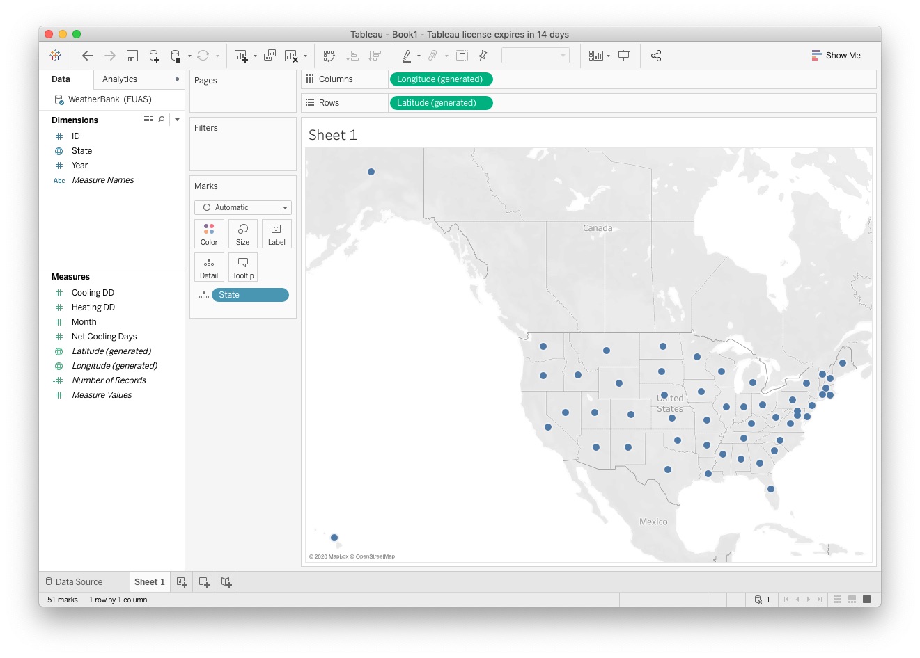
- Let's explore a little of what we're seeing. Tableau has automatically generated a map for us of the United States. When it read in our data, it correctly guessed that all of the abbreviations under the State column aligned with one of the 50 states, and constructed a map, with Longitude as our y axis, and Latitude as our x axis, as shown in the two bars at the top of the page. Now that we have the dimensions we'll be working with, let's put some data on our map.
2) Click and drag Net Cooling Days from Measures and release over the map
- You should see this image:
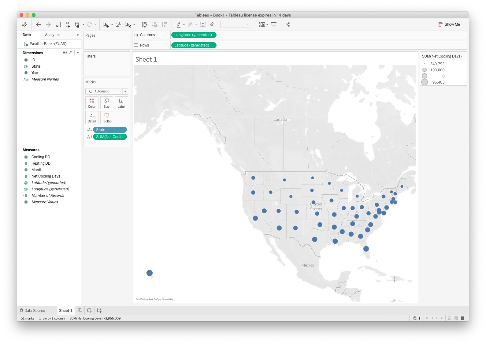
- Now, all of our dots, which previously connoted each state, have changed size. We've told Tableau to make their size relative to the selected measurement, which in this case was Net Cooling Days. Towards the left of the screen, you'll be able to see a box called Marks. Marks keeps track of all elements you have active in a current sheet. Next to the name of each element, we can see symbols. Those symbols dictate how the data will be portrayed on the sheet. Right now, as indicated by the small and big circle, our Net Cooling Days variable is being represented by circle size, with the larger the circle is representing the more days were "cooling days". It's important to note here that there is no time axis on this graph. Even though our data has information for each states over a number of years, all that data has been aggregated by sum for each state in this representation. Let's change how we're presenting that data now.
3) Click the double circles next to SUM(Net Cooling Days) under Marks control, and change it to Color
- Your sheet should now look like this:
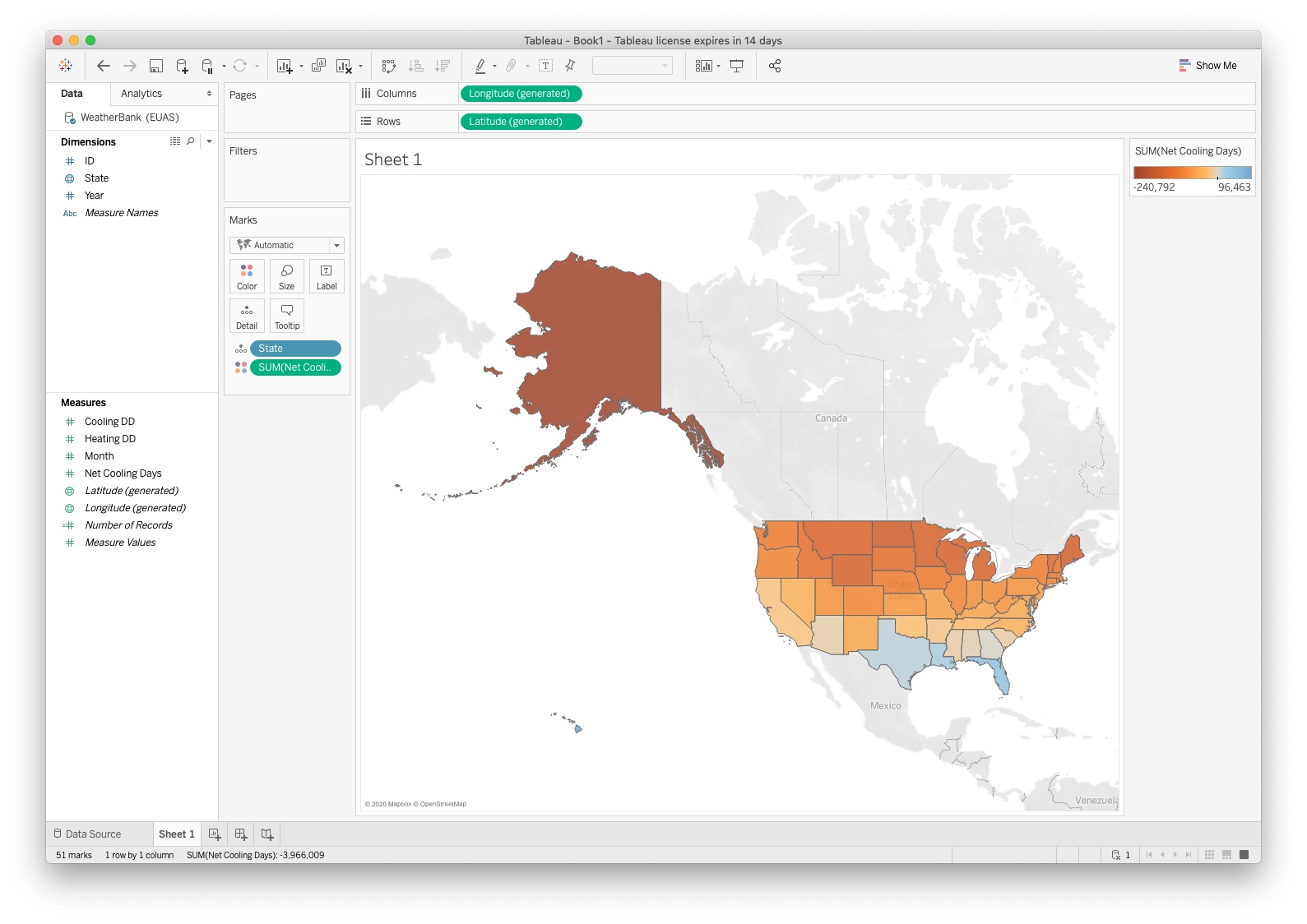
- Instead of our dot size showing the magnitude of the data, the color of our states shows this, with the key in the top right of the sheet. However, the colors are inverted from what we would like. In the current visualization, the hotter a state is, the more blue it is, while the cooler a state is, the more red it is. Let's fix that.
4) Click on Net Cooling Days under Marks, then click Color
5) Click Edit Colors
6) Click the bar under Palette, then Red-Blue Diverging
7) Click the box Reversed then Okay
- Your map should now look like this:
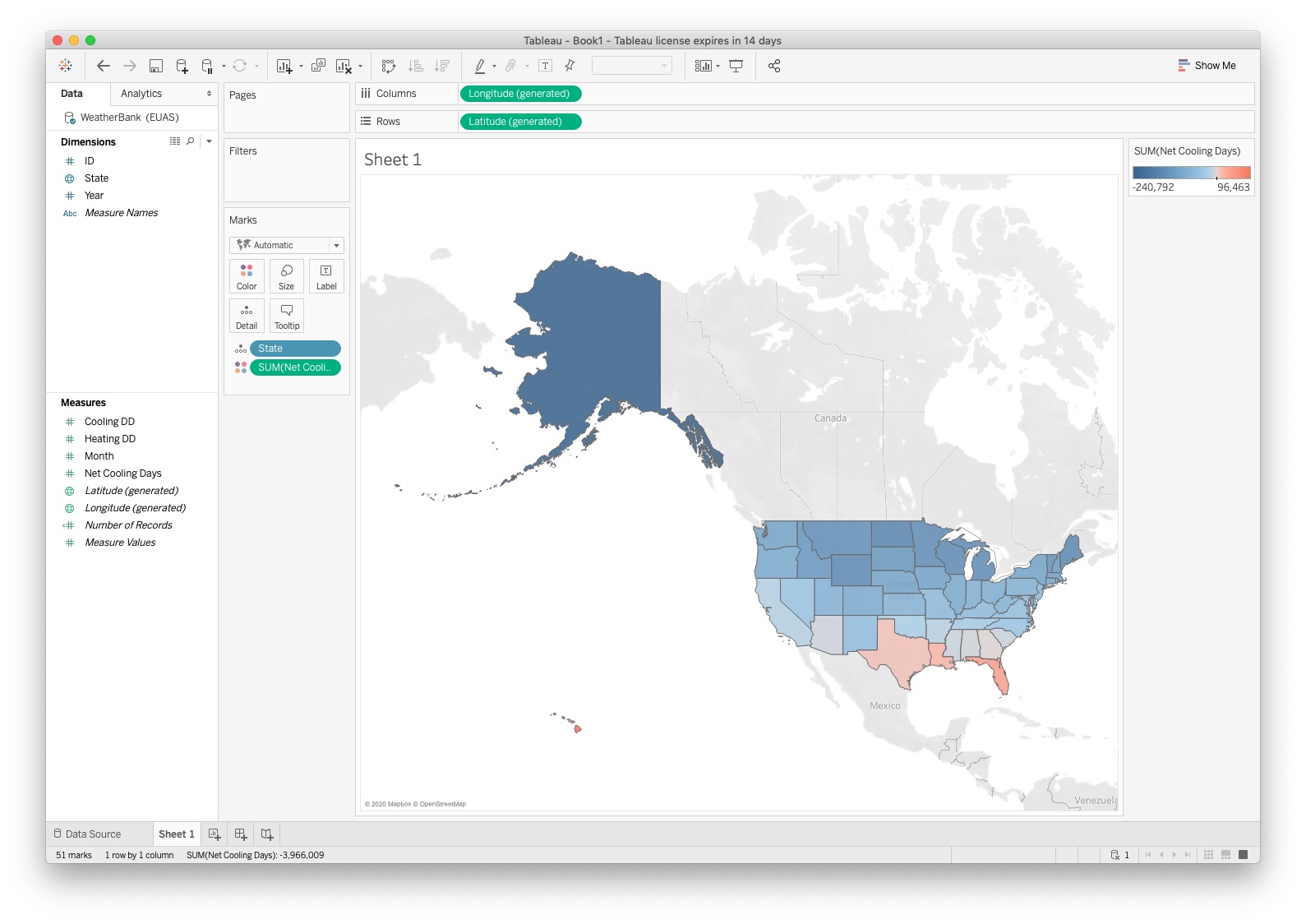
- As you saw, there are many different options for colors, including creating your own different metrics. Feel free to experiment around with them. So what are we looking at now? We've constructed a map that shows overall trends of which states are warm, and which are cold. Unsurprisingly, the farther north the state is, the colder it is and more energy is required to heat the houses. Go south, and you get warm. But really this doesn't tell us much. To get a better look at what the story really is here, we'll need to look at this data over time.
8) Click the button in the lower left corner of the screen, next to the Sheet 1 button to create a new sheet
Merging Line Visualization
- Our previous visualization was of a map, with no way to look at the change over time. Let's now create some graphs with time as an axis to look at the pattern of change
Drag Year from Dimensions to Columns at the top of the sheet, and Heating DD from Measures to Rows. After the drag, the rows has an element labeled
SUM(Heating DD)to indicate that, to be used as a value, theSUMaggregation will be performed.Note that, if the instructions above were not followed, you might have the issue where your Year variable is a Measure, not a Dimension. If that's the case, simply right click it, and select "Convert to Dimension".
The result of this step is a bar graph with Years in the $x$ (column) dimension and the sum of the values of Heating DD in the $y$ (row) dimension.
Now that you have a bar graph, look to your Marks box on the left side of your screen. Under the word Marks, click the drop-down menu labled automatic, and switch to to Line
You should have a graph which looks like this:
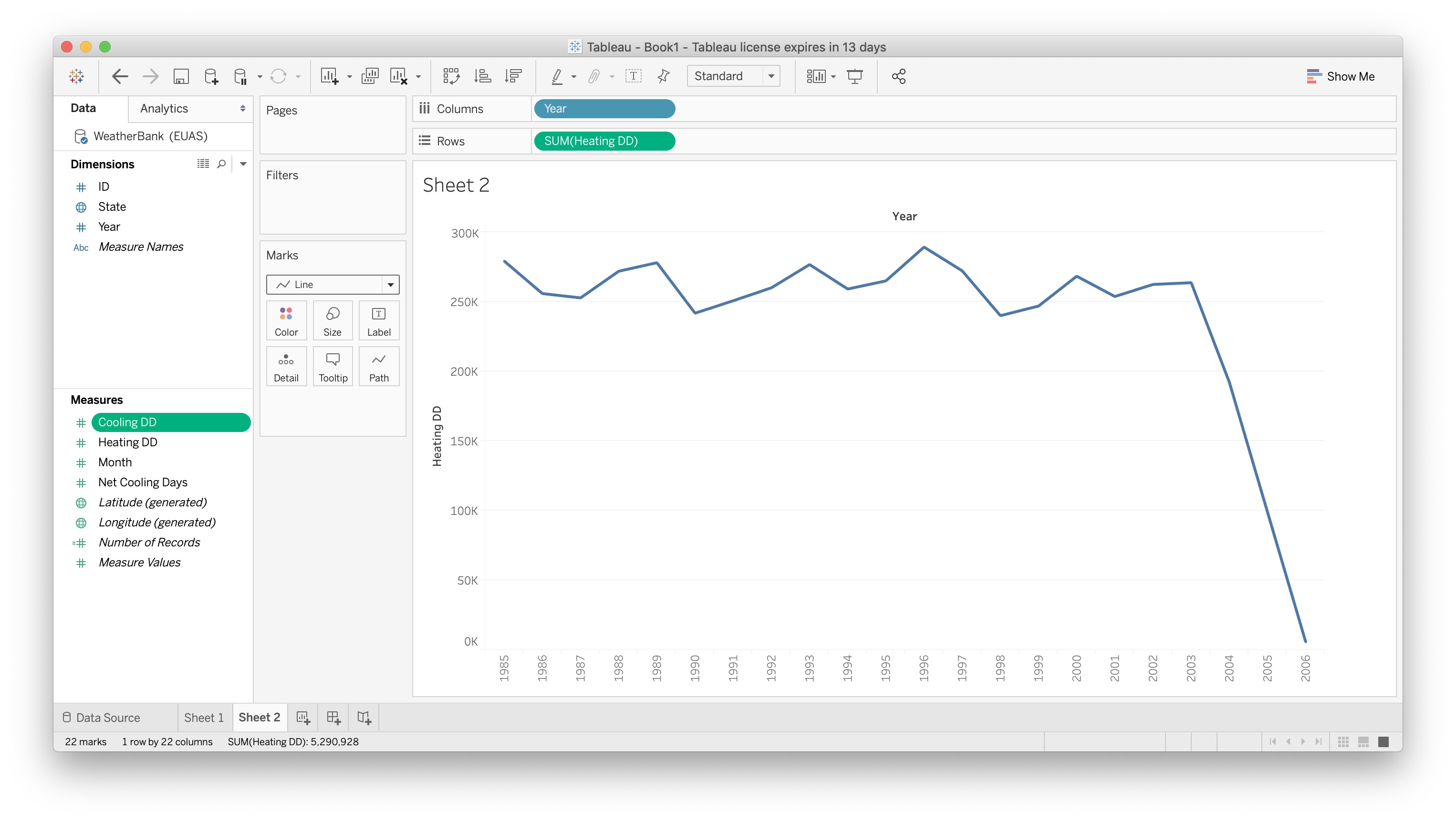
What information is being displayed here? We can look at each year since the data started being recorded in 1985 through 2006. For each of those years, we can see trends in the number of Heating Degree Days. If you recall from earlier, a Heating Degree Day is a day which requires an energy expenditure to heat a room or house to 70 degrees, which is viewed as an average room temperature. From this, it looks like since 2003, there's been a dramatic decrease in the number of Heating Degree Days. This could be a real effect, or could be related to incomplete data. Lets expand our graph a little bit.
We want to see and compare cooling days in the same visulaization with heading days. The easiest way to accomplish this is to drag Cooling DD from Measures to Rows where
SUM(Heating DD)resides.You should have a visualization containing two graphs:
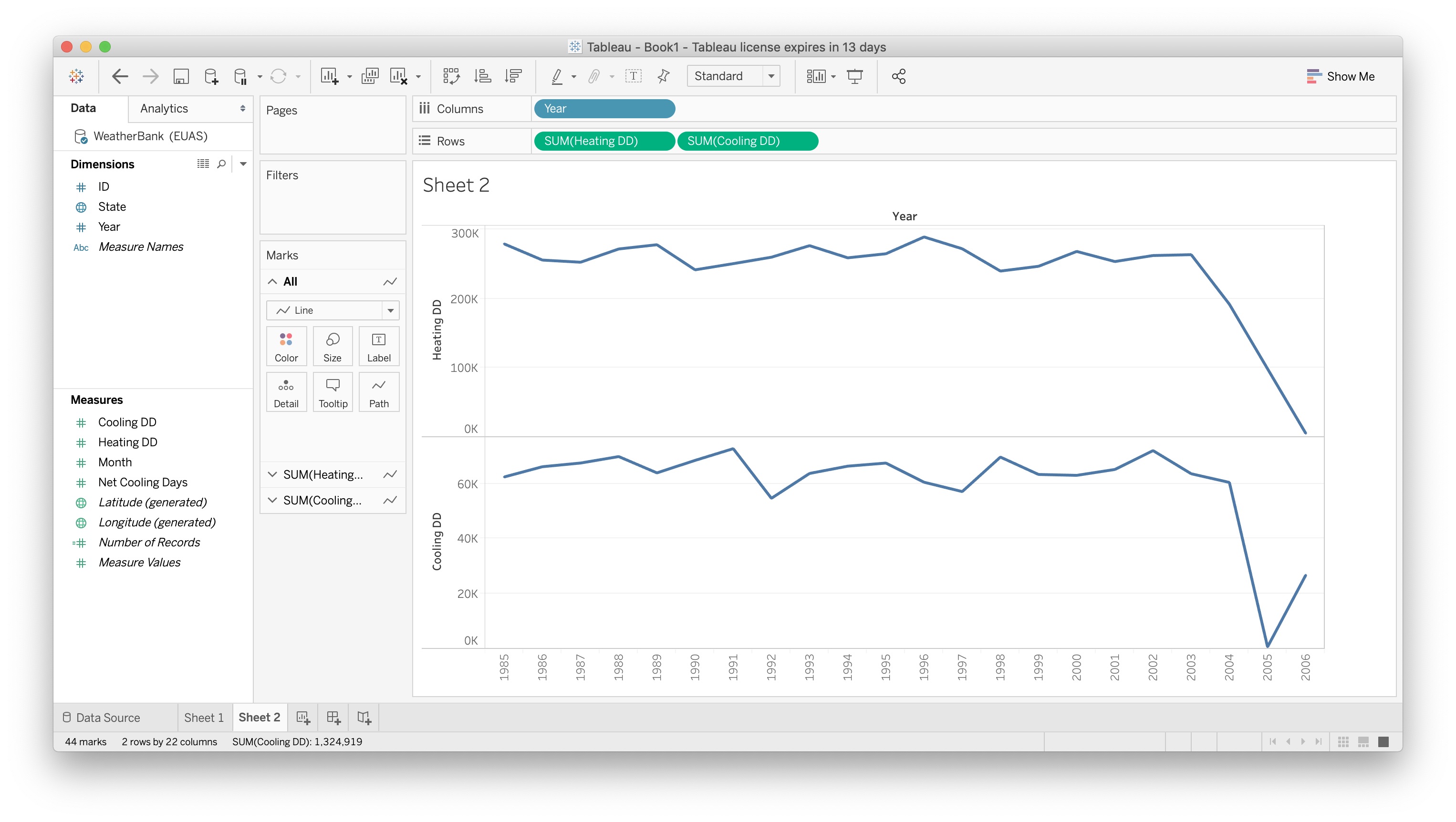
The order of the two measures in rows determines which subgraph is on the top and which is on the bottom.
But we may want to see both line graphs incorporated in a single graph with a common $y$ axis to more directly compare the number of Heating Degree Days and Cooling Degree Days in a year.
Drag Cooling DD from Rows until the elment is hovering on top of Heating DD on the y axis of the Heating DD graph till two green bars appear, then release.
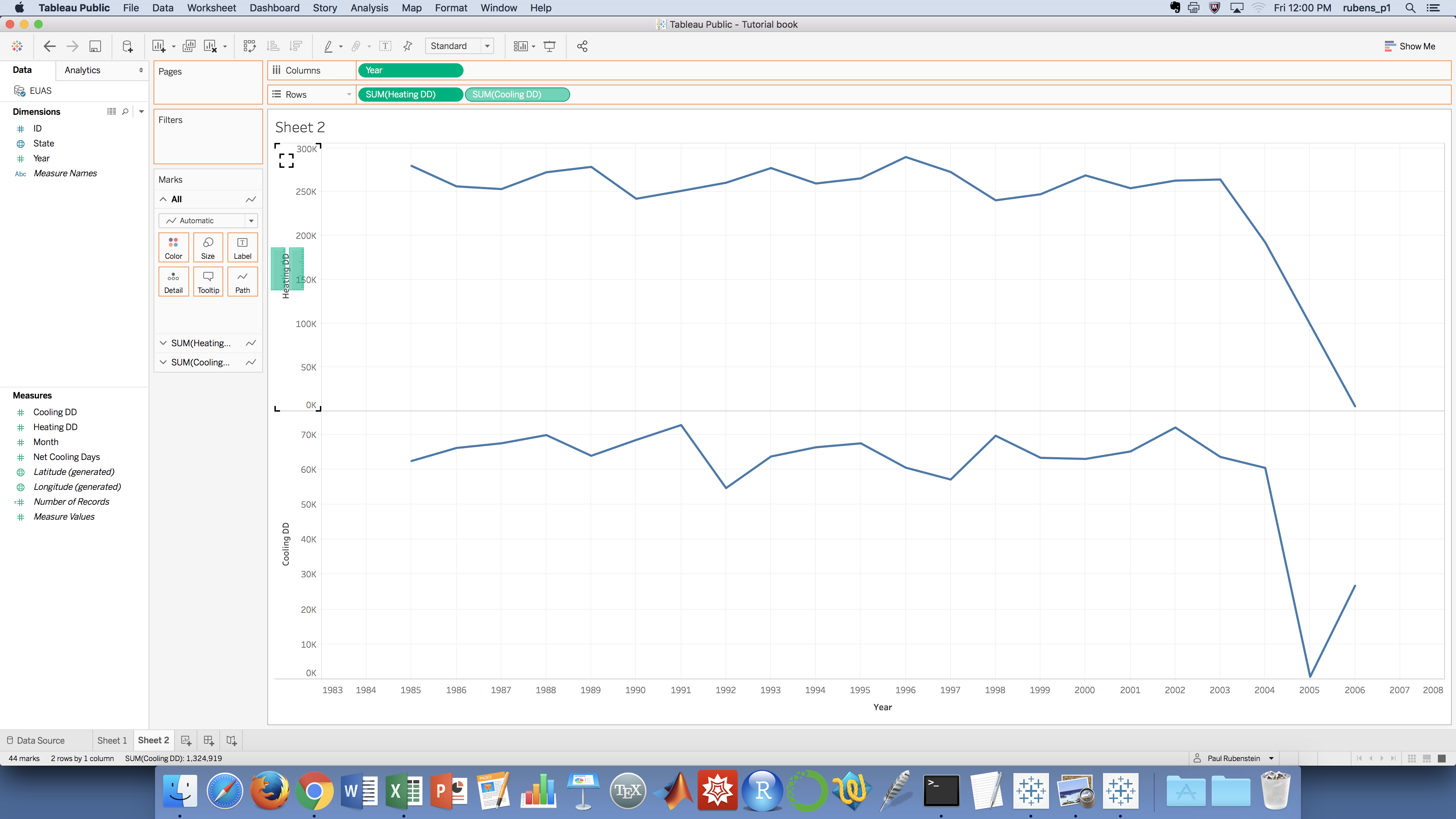
The result should be the following:
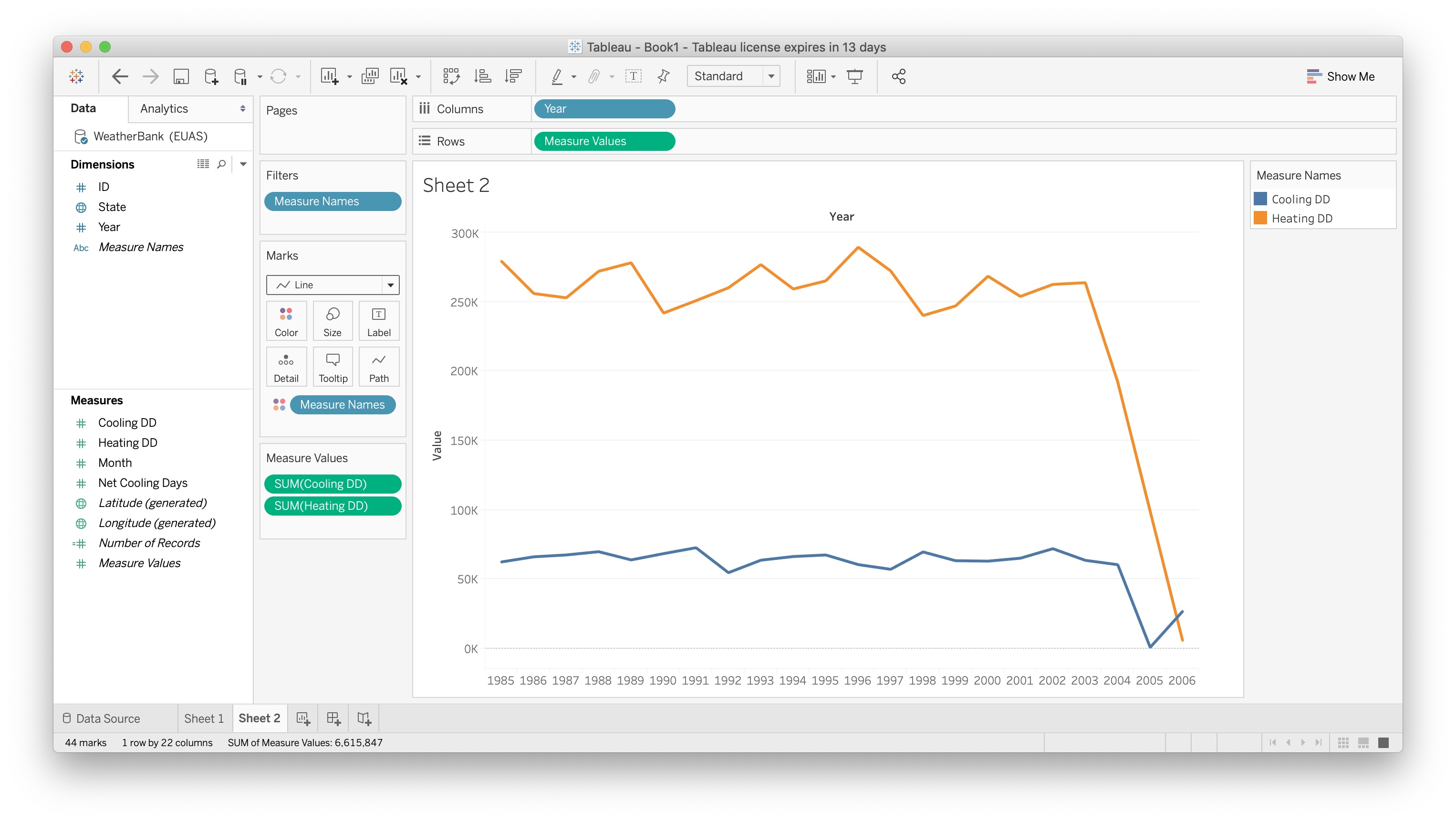
If the $x$ axis does not extend over the width of the window, you can hover over the $x$ axis labels on the right end until your cursor becomes a double-ended arrow. Then drag to the right until you get the $x$ axis to extend to wherever you like.
What does this image tell us? It looks like Cooling days have been much more steady over the last few decades, which a dip over the last few years which has steadied out. When you compare Heating days, the change has been much more dramatic. Let's add Net Cooling Days to finalize this graph for a full comparison.
Drag Net Cooling Days from Measures to Measure Values, where Heating DD and Cooling DD are already present.
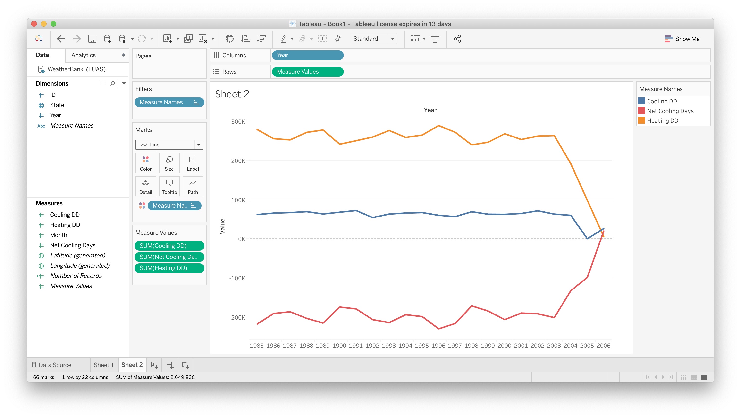
What we see now is a graph with general temperature trends over the last three decades. It looks like the number of days per year which require people to heat their homes are on a decrease, and the general trends in temperature have been upwards increasing. Let's look now at how this is affecting each individual state in energy consumption.
Filtered Line Visualization
- Here, our goal is to filter a Measure of our data by one of our Dimensions and show in a visualization.
Create a new sheet for this visualization.
Populate the rows and columns of the visualization by adding Dimension
Yearto Columns and MeasureNet Cooling Daysto Rows. Select a line graph instead of a bar graph.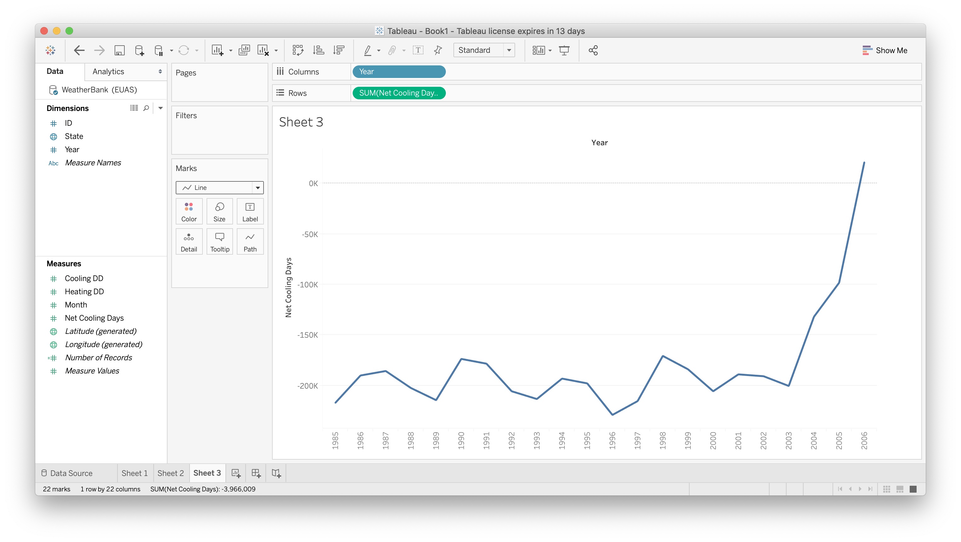
Add the Dimension
Stateto the Detail subsection of Marks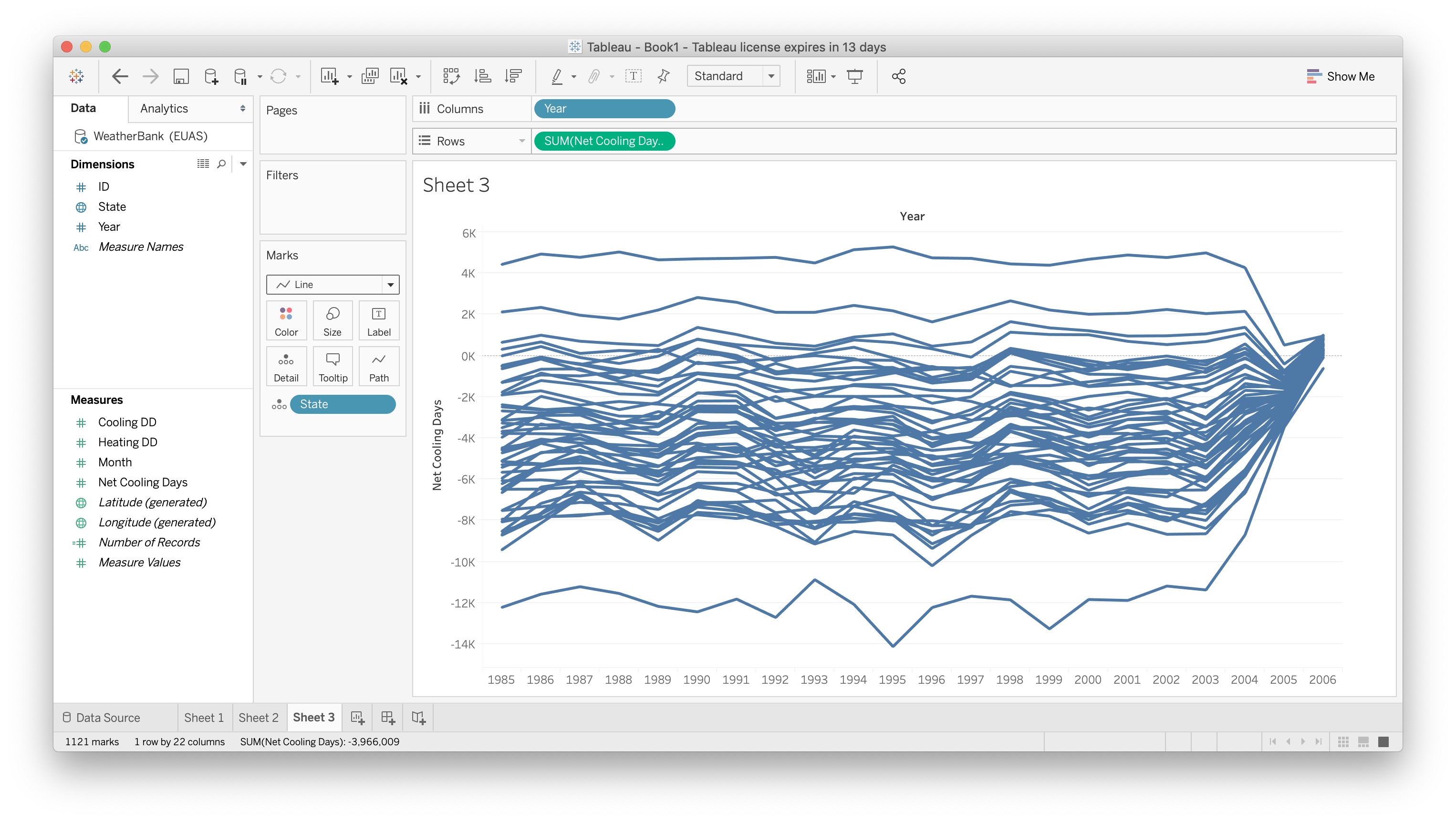
We have essentially disaggregated the aggregate parameter
SUM(Net Cooling Days)by the dimension ofState. If you mouse over each line, you'll be able to see it correlates to a specific state, and their measurement for their number of net cooling days. Right now though, the lines are a jumble and hard to distinguish from one and another. Let's add the same color coding we had in our previous graphs to this one to help comprehension. The top line is HI, for Hawaii, which has the most cooling days, and the bottom line is AK, for Alaska, which has the least cooling days.Drag
Net Cooling Daysfrom Measures into the Marks, and drop it on the ColorFollow previous steps from Map Visualization to set line color to Red-Blue diverging, and reverse their colors
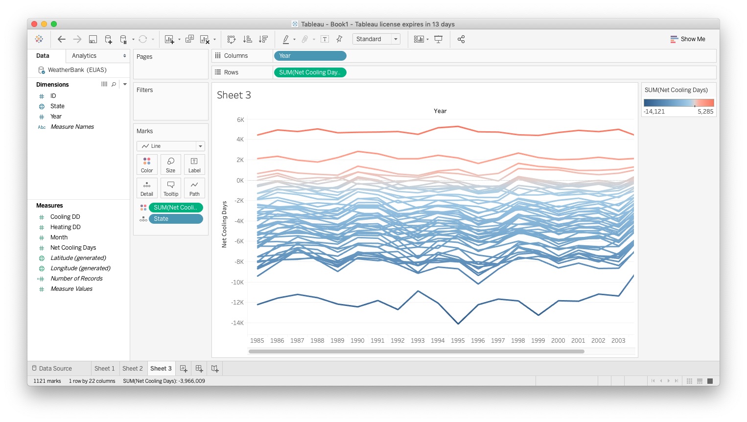
- Now, each line corresponds to a state, with appropriate color coding like our Map Visualization to make data comprehension clear. Let's add a bar graph to our analysis, and then we'll be ready to put it all together.
Bar Graph Visualization
- Now we're going to learn how to visualize our data as a bar graph. This is quite simple to do
Create a new sheet.
Add
Stateto Columns andNet Cooling Daysto RowsAnd you have a simple bar graph. A bar graph with 50 bars is too busy, particularly without any organization. While a better visualization would be to group states into logical regions and then show the net cooling days per region, we can at least improve the current visualization by selecting an ordering for the bars.
Click on the down arrow on the right side of the
Stateelement in the Columns specification of the sheet. From the drop-down selectSortand change Sort By to "Field". The result should look like the following figure. While still busy, we can now see the progression of states from AK on the left to HI on the right.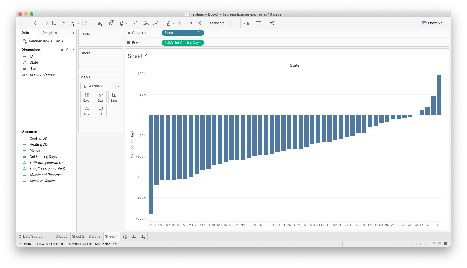
Box and Whiskers
Let's explore a little more of what you can do with Tableau. In the upper right corner of your screen, there's a button called Show Me, and if you click it now, you will see a set of possible graph types:
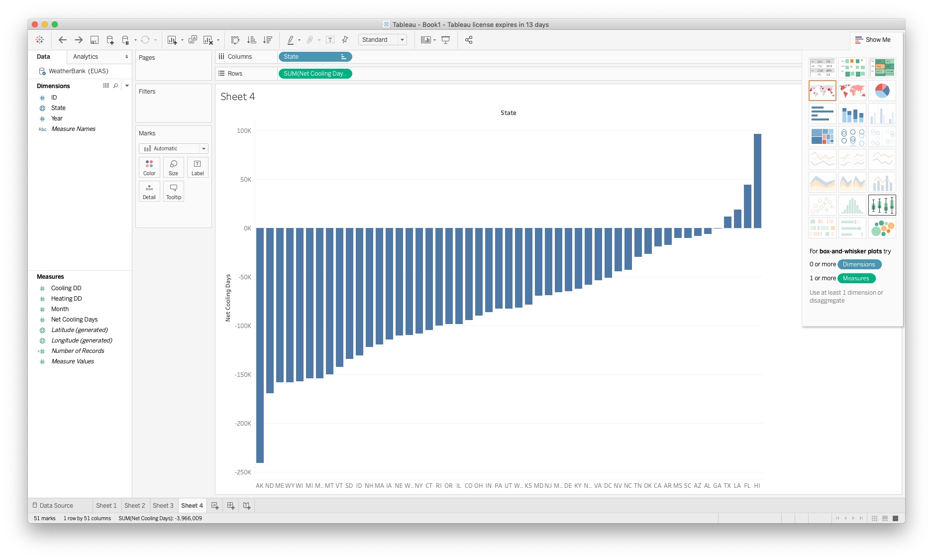
By clicking show me, Tableau will show you all different types of charts and graphs it can create automatically. Feel free to experiment around with those, but be aware that you might need to reset your graph, as Tableau will automatically mutate your sheet in doing so. This is a fairly painless thing to do however
- The easiest way to reset your sheet is to delete all variables you have curently placed on your sheet, and replace them in the Rows and Columns section
For this example, we'll be exploring the creation of a box-and-whiskers plot:
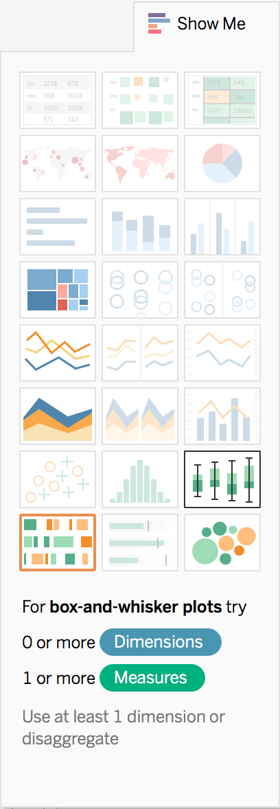
Click the option one up from the bottom right, the Box-and-Whiskers Plot
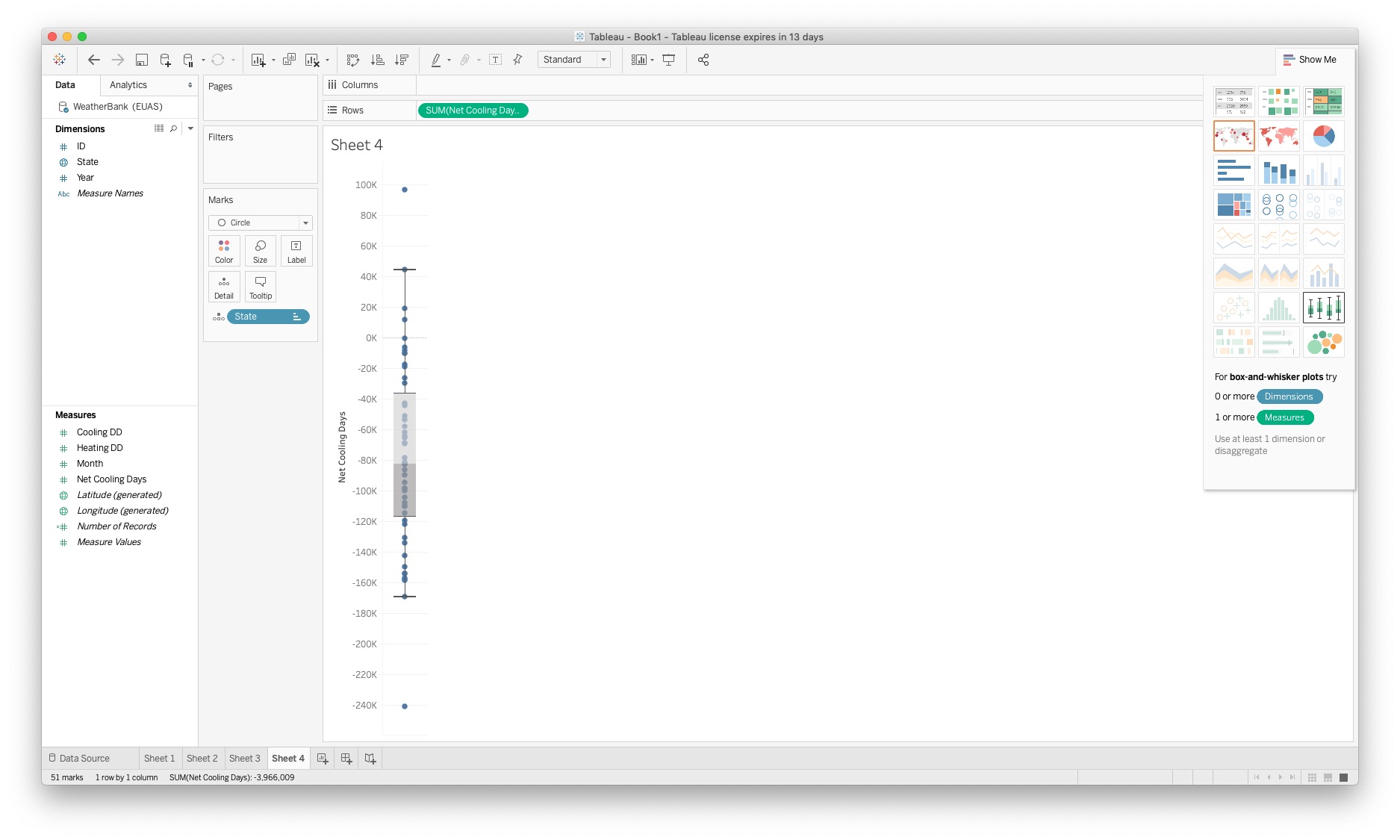
The resulting plot is a visualization where it has moved our sorted
Statedimension, which has in Columns into Marks as a *Detail. The result has nothing for theColumns(the x-axis),SUM(Net Cooling Days)for theRows(the y-axis).Our objective is to spread the visualization out so that the
Statedimension, along withYearcomprise the Rows ($x$-axis)Add
StateandYearfrom Dimensions into Columns. If you dragStatefrom the Marks detail, you will be undoing part of the setup from ShowMe in creating the box-and-whiskers plot.Click the down arrow of the
Yearelement in Columns and ensure thatYearis being treated as a continuous variable.This plot gives us a tremendous amount of information. Notice the horizontal scroll bar at the bottom. To be able to see the data from all fifty states, we need to scroll back and forth. While fine for an interactive graph or dashboard, this would be a poor visualization choice for a report. At most about a dozen bar-and-whiskers could be understood and interpreted in a single graph in a report.
One of the advantages of the box and whiskers plot shows us which of our data points are outliers from the rest. If any of the points exceed the two outer horizontal lines, they're considered outliers. Tableau does the math for us in the background, and now we can see for each year and for each state which of the Net Cooling Days are considered "normal", and which are outliers.
[Optional] We could enhance our visualization by making the individually shown data points reflect the color scheme we have used in our earlier visualizations. To accomplish this, we drag the
Net Cooling Daysmeasure into the Marks region and drop it over the Color section. We can then click on Color and Edit Color as before.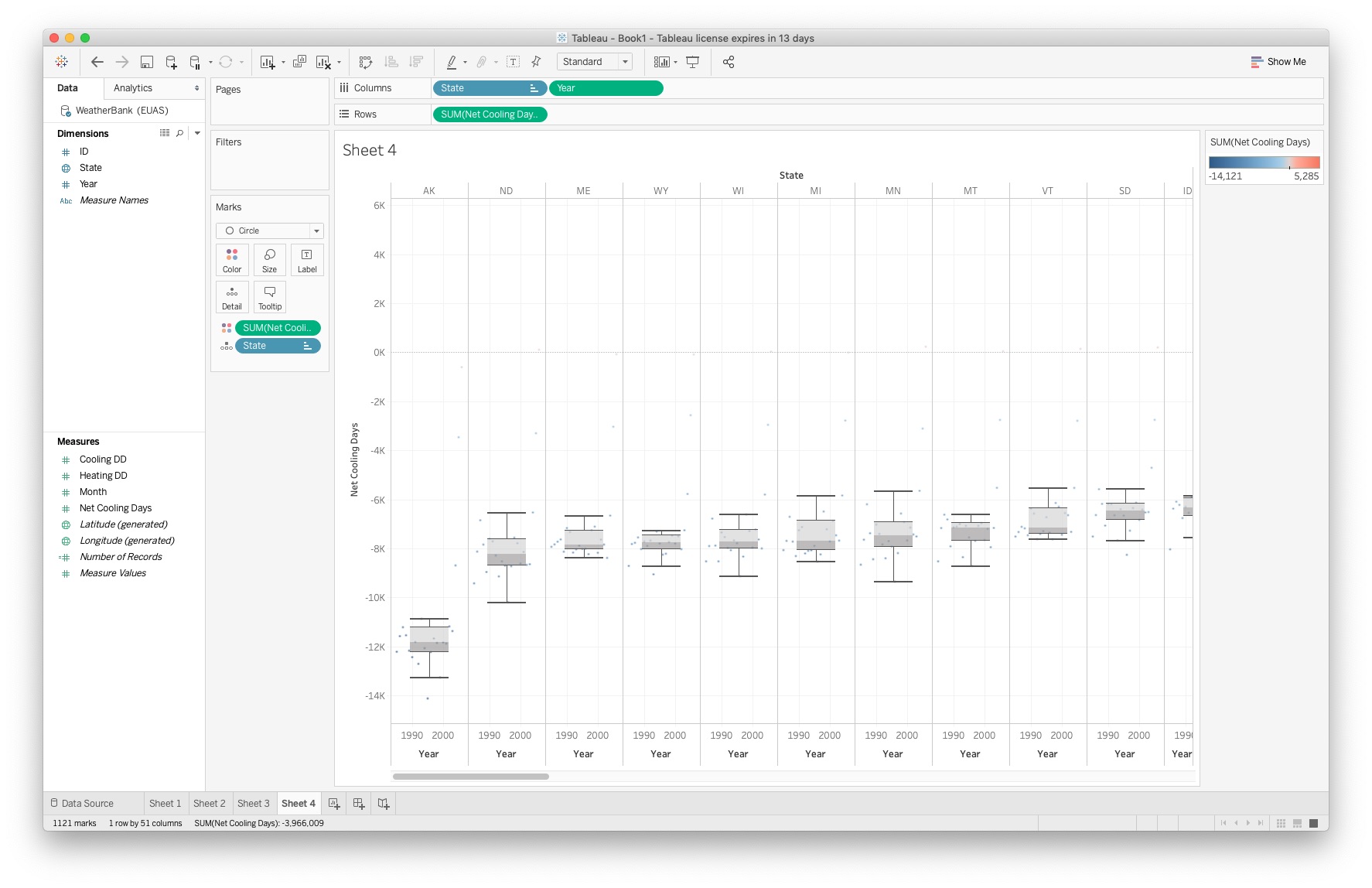
Other Worksheet Actions
A good visualizations should ensure that a graph has a good, clear title, that axis are labeled clearly but succinctly and include units, and that a program's annotations (like "Sheet 1") that convey no meaning to a reader have been eliminated. Legends should also be included if they contain information needed to interpret the visualization.
This practicum does not delve into each of these steps, but most are fairly intuitive to accomplish in Tableau.
When a worksheet represents a final visualization, you would typically then export it to a jpeg file. This is done through the menu system, where you select
Worksheet -> Export -> Image ...
and then, from the dropdown, choose a jpeg image.
Dashboards
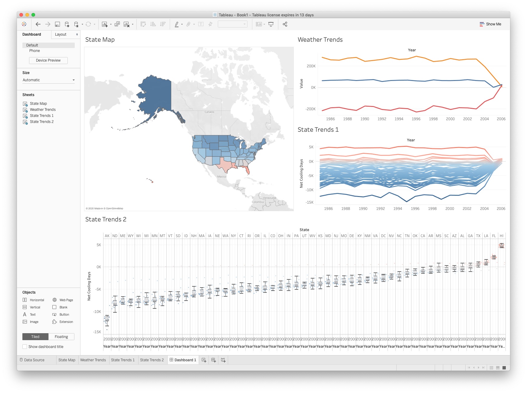
At this point, we should have four distinct sheets, one for each of the visualizations developed in this practicum. They are named Sheet 1, Sheet 2, Sheet 3, and Sheet 4. When working with visualizations, particularly targeted for an online or interactive presence, we often want to group them together into a Dashboard.
We want meaningful names for each of the worksheets we want to gather together into a singledashboard. Right click on each sheet in the lower left corner, and select Rename Sheet
You can name them whatever makes the most sense to you, but we have chosed
State Map,Weather Trends,State Trends1, andState Trends2, respectively.Next to the New Sheet button, click New Dashboard instead
In the panel on the left at the top, you should see Dashboard and Size subpanels. Change the Size from
FixedtoAutomatic.In the panel on the left, you should see a Sheets subpanel with your four sheets listed. Drag your State Map sheet onto your dashboard
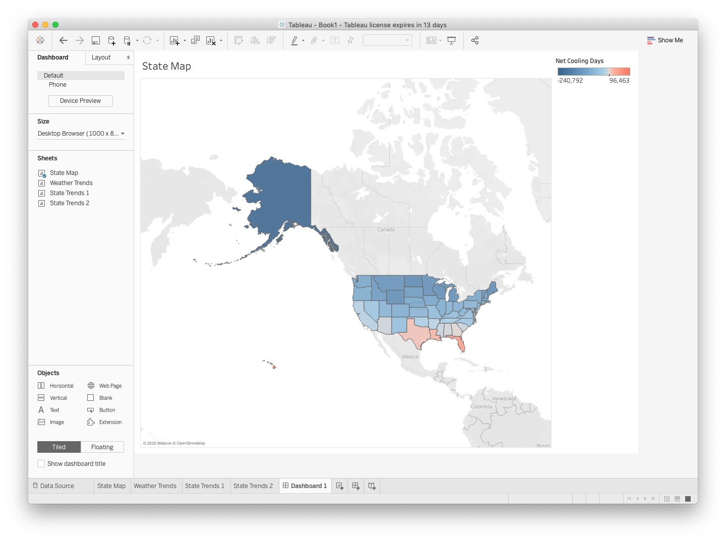
As you can see, your dashboard now consists of your first sheet, with the key being automatically transposed ontop of it. If the legend is not helpful, you can click on it as an individual item and remove it from the dashboard
Move the rest of your sheets onto your dashboard. As you drag, the display will shade the area so that you know how the tiled arrangement of sheets within the dashboard will be placed. In our dashboard, we chose the box-and-whiskers to appear across the full width.
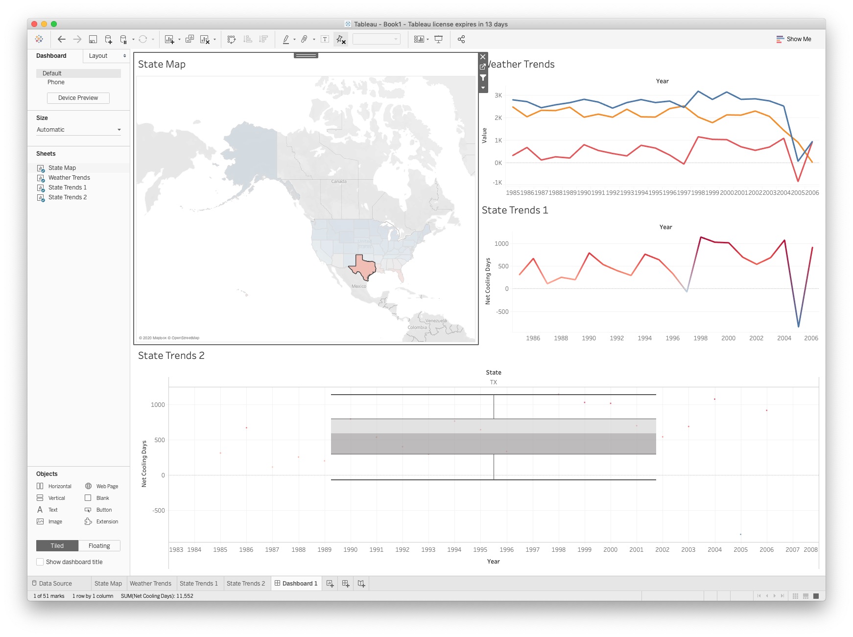
One of the advantages of interactive visualizations is that the user can use the mouse to get more detailed (filtered) information. Click your State Map visualization on the dashboard, then click the third icon down, which looks like a funnel button. It should give the feedback to "Use as a Filter"
Try clicking on a particular state on the map. Then click the same state again. Hopefully you can see and appreciate the value of using one representation/sheet to act as a filter for the others.
If the box and whiskers is too busy, but we know that our dashboard is going to be interactive, we can change how that particular worksheet is "Fit" in the dashboard. Click on the
State Trends 2sheet and, using the drop down, select Fit->Standard. This brings back the horizontal scroll bar so that you can navigate the visualization to see all fifty states.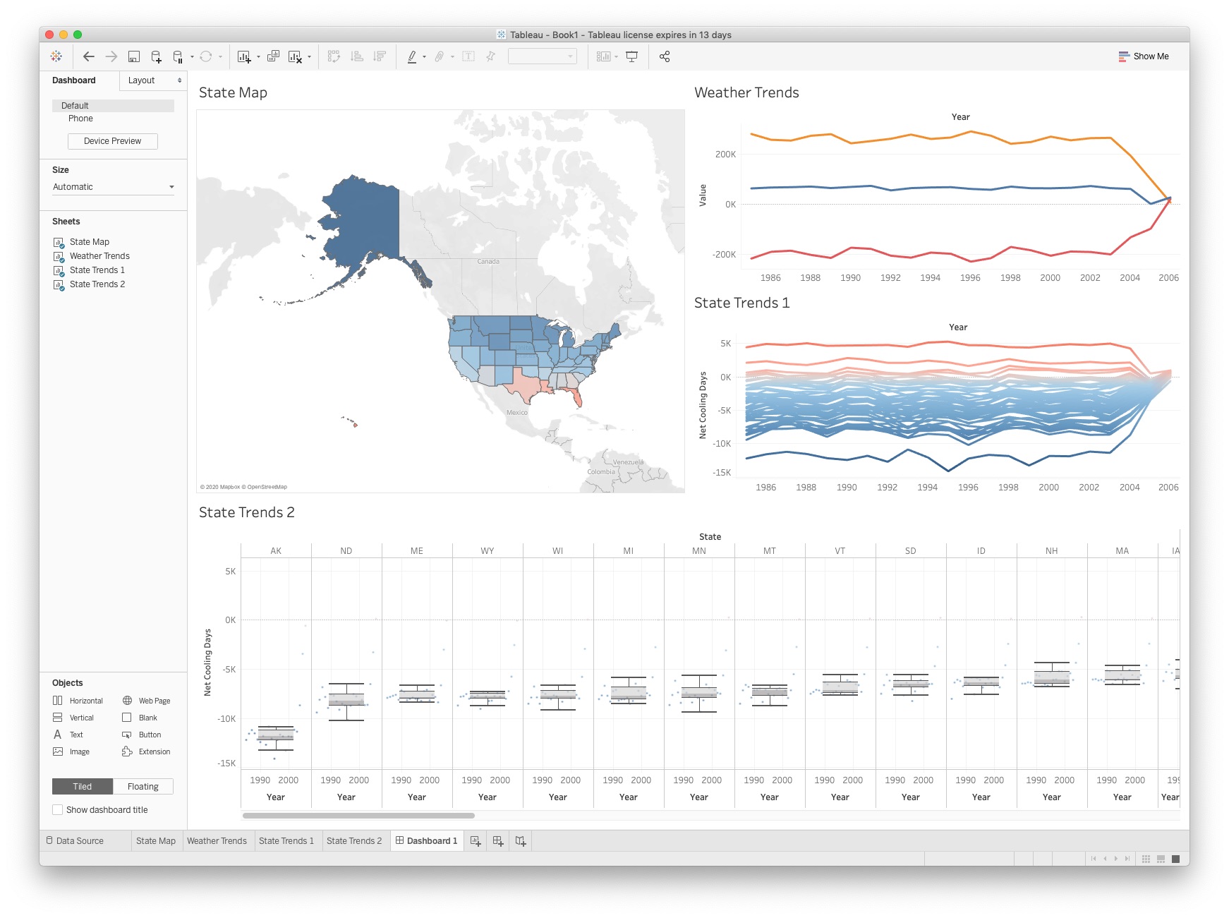
Finish by saving your work (i.e. the complete Tableau "Book"). Also, with your final dashboard being displayed, from the Menu select
Dashboard->Export Image ...
and select a jpeg image, and give a name tableau_practicum.jpg. This is the file you will upload to Notebowl to demonstrate your completion of the practicum.
Obviously Tableau contains much more than we went over in this tutorial, but the best way to learn is to explore. Additionally, this link: https://public.tableau.com/en-us/s/resources covers many of the topics we went over in video form. Happy visualizing!